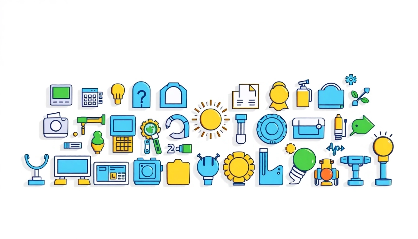
The Evolution of Icons in Design
Icons have become integral to contemporary design, providing not just visual interest but also functional utility in digital interfaces. From early pictograms used in ancient civilizations to the sophisticated graphic symbols of today, the evolution of Icons illustrates a dynamic interplay between form and function. This article delves into their historical context, modern interpretations, and pivotal role in user experience.
Historical Overview of Icons
The concept of icons has rich historical roots, dating back thousands of years. Ancient Egyptians, for instance, utilized hieroglyphs—symbols representing sounds, words, and ideas—to communicate complex information. Similarly, ancient Roman mosaics showcased intricate designs that could be interpreted as early forms of icons. During these times, icons served practical purposes, conveying messages and denoting status or identity.
Fast forward to the advent of the digital age, where icons transitioned dramatically. The introduction of personal computing in the late 20th century revolutionized how users interacted with technology. The graphical user interface (GUI) became a staple, with iconic representations of files, folders, and applications. This shift reinforced the idea that visuals could transcend language barriers, making technology accessible to a broader audience.
Modern Interpretations and Trends
In recent years, trends in design have led to a surge in the variety and complexity of icons. The move towards minimalism has influenced icon design significantly—designers now favor simple, flat icons over skeuomorphic designs, which mimic real-world textures and appearances. This trend aligns with the broader movement towards user-centric design, where ease of understanding and interaction is paramount.
Moreover, the use of vibrant colors and dynamic animations has emerged as a modern interpretation in icons. Animated icons not only capture attention but also guide users through interactions, enhancing usability. As seen in mobile applications, icons now incorporate gestures and transitions, creating a fluid user experience.
Importance of Icons in User Experience
Icons play a critical role in enhancing user experience (UX). Effective iconography simplifies navigation and reduces cognitive load by allowing users to identify actions at a glance. For example, a simple envelope icon universally conveys the concept of messaging, thereby promoting immediate recognition and understanding.
Research indicates that users respond positively to intuitive icons, which increases engagement levels. Conversely, poorly designed icons can lead to confusion and frustration, ultimately impairing the overall user journey. Thus, a keen understanding of the principles of icon design is essential for any digital interface.
Types of Icons and Their Applications
Flat Versus 3D Icons
Icons can primarily be classified into flat and 3D designs, each serving different purposes and aesthetic goals. Flat icons embody a minimalist aesthetic, utilizing simple shapes and solid colors to present a clean, accessible visual experience. This style aligns seamlessly with modern web design practices, allowing for quick loading times and compatibility across devices.
On the other hand, 3D icons offer depth and richness, utilizing shadows and gradients to create a more tactile sense of interaction. These icons may be more visually engaging, but they can also demand greater processing resources, making them less suitable for certain contexts. Designers must carefully consider their audience and the objectives of their application when opting for either flat or 3D icons.
Icons for Web and Mobile Interfaces
Web and mobile interfaces are the primary arenas for icon application. In web design, icons can denote actions like ‘download,’ ‘share,’ or ‘settings,’ often improving navigation and user engagement. Icons help break up text-heavy sections, drawing the user’s eye and providing visual breaks that enhance readability.
In mobile interfaces, icons are even more crucial due to limited screen real estate. They must convey meaning effectively while remaining aesthetically pleasing and functional. A well-designed app may utilize icons to represent features, categorize content, or provide shortcuts, increasing overall usability.
Industry-Specific Icon Usage
Icons are not merely decorative elements; they are laden with meaning and purpose that varies significantly across industries. For instance, in healthcare applications, icons must be highly recognizable and convey critical information quickly, such as emergency services or patient health records. Here, clarity is non-negotiable, as the very nature of the industry demands accuracy and swift interpretation.
Conversely, e-commerce platforms utilize icons for actions such as ‘add to cart’ or ‘view product,’ steering user behavior towards purchasing decisions. The implications of icon usage therefore extend beyond aesthetics, directly influencing user actions and, ultimately, business outcomes.
Best Practices for Designing Icons
Maintaining Consistency Across Platforms
Consistency is paramount in icon design. A cohesive set of icons across platforms ensures that users have a uniform experience, reinforcing brand identity as well as familiarity. Designers must consider how icons will appear on various devices, from desktops to smartphones, and ensure that size, shape, and color remain consistent.
Utilizing a design system or style guide can foster consistency, particularly in larger teams. Such systems outline specifications for icon usage, including dimensions, color codes, and spacing, promoting harmony within digital assets.
Color Schemes and Their Impact on User Behavior
The color of icons significantly influences user perception and behavior. Colors evoke emotions and can subtly guide users toward desired actions. For example, red often signifies urgency (think ‘buy now’ or ‘alert’), while green typically denotes success or completion.
Effective use of color schemes in icons can enhance user engagement and satisfaction. However, designers must also consider accessibility; selecting color combinations that are easily distinguishable for colorblind users is crucial. Thus, integrating contrast and texture, alongside color, can mitigate potential accessibility issues.
Accessibility Considerations for Icons
Accessibility plays a vital role in icon design. Icons must be designed not only for aesthetic purpose but also for inclusivity. Offering alternative text descriptions for each icon helps visually impaired users understand actions or features. Additionally, ensuring that icons are recognizable, regardless of size, supports a broader range of users.
Furthermore, usability testing with diverse user groups can uncover accessibility pitfalls within icon design. Engaging with real users provides invaluable insights, allowing designers to refine icons based on feedback and usability quirks.
Tools and Resources for Icon Design
Popular Software for Icon Creation
The realm of icon design boasts a variety of tools catering to different levels of expertise, from novice designers to seasoned professionals. Software such as Adobe Illustrator and Sketch remains prevalent, offering extensive capabilities for vector graphics, allowing precise icon design.
Additionally, web-based tools like Figma promote collaborative icon design, permitting teams to work concurrently on projects. This is especially useful in fast-paced design environments where timely feedback and iterative improvements are critical.
Free and Paid Icon Libraries
Icon libraries present a rich resource for designers, offering both free and premium options. For instance, platforms like Flaticon and The Noun Project provide vast collections of customizable icons that ease the design burden. These libraries can help designers find inspiration or expedite the design process, particularly when time constraints are present.
Conversely, paid icon sets often provide higher quality and uniqueness, potentially better aligning with brand identity and visual standards. Invest wisely in icons that resonate with your specific audience and objectives.
Collaboration Platforms for Designers
In the world of design, collaboration is key. Utilizing platforms such as InVision or Zeplin fosters teamwork by streamlining workflows, allowing designers to share ideas, receive feedback, and iterate on designs effectively. Such tools not only enhance the quality of icons but also nurture a collaborative culture, essential for innovative design practices.
The Future of Icons in Digital Interaction
Emerging Technologies and Icon Design
As technology continues to evolve, so too does the landscape of icon design. Emerging trends showcase icons that integrate seamlessly with augmented reality (AR) and virtual reality (VR) environments. In these immersive settings, icons must be adaptable, maintaining clarity and meaning even in three-dimensional spaces.
Additionally, advancements in responsive design require icons to be dynamic, resizing and reconsidering their arrangement based on user behavior and device capabilities. Designers must keep abreast of these innovations, ensuring their iconography remains relevant and impactful.
Integrating Icons with AI and Machine Learning
Artificial intelligence (AI) and machine learning are also reshaping the future of iconography. These technologies can analyze user interactions and preferences, enabling the creation of adaptive icons that evolve based on user behavior. For instance, AI could recommend icon changes based on usage patterns, thereby enhancing user experience without necessitating extensive manual input from designers.
Predicting Future Trends in Iconography
Looking ahead, icon design is poised to become even more personalized and context-sensitive. Expect to see icons that not only convey meaning but also align dynamically with user preferences and situational context, resulting in interfaces that feel increasingly intuitive.
The future will likely see a greater emphasis on usable, engaging icons that leverage hard data to navigate the demands of users and respond to their needs effectively. By anticipating these trends, designers can remain at the forefront of innovative icon design, delivering engaging and functional user experiences across platforms.