Understanding Icons: Their Importance in Design
Defining Icons and Their Role
Icons serve as a visual shorthand that communicate ideas, functions, or information in a myriad of contexts. At their core, icons are simple, recognizable symbols that can efficiently convey messages without the need for extensive text. In an increasingly digital world, where user attention spans are dwindling, the importance of icons has never been greater. They enhance the usability and aesthetic appeal of digital products while simplifying user interactions.
Icons can be found in nearly every corner of the digital landscape—from websites and mobile apps to social media. Their role is to create a seamless navigation experience, guiding users intuitively through interfaces. As an additional layer of communication, they can also establish brand identity and add a level of artistry to a product. For instance, integrating well-designed icons can dramatically elevate the perceived quality of a user interface, making the user feel more engaged and connected to the content.
Types of Icons: Digital, Social Media, and More
Icons can be grouped into several categories based on their usage and context:
- Digital Icons: These are the standard icons used in digital environments, such as application icons, file icons, navigation buttons, and action buttons. They are essential for enhancing the user experience by providing visual cues.
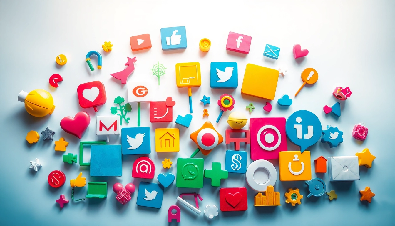
- Social Media Icons: Tailored for branding and engagement, these icons typically represent various social media platforms. They help users identify and connect with your social presence, thereby fostering community and interaction.
- Informational Icons: Used to communicate information succinctly, such as warning signs, notifications, or alerts. They can help in fast recognition of critical information, improving user efficiency.
- Product Icons: Often associated with e-commerce, these icons represent product features or benefits and are integral in guiding customer purchases.
Each type of icon serves a unique purpose, and understanding these categories can help designers select the right icons for their specific needs.
How Icons Enhance User Experience
Icons significantly enhance user experience by improving navigation, increasing aesthetic appeal, and facilitating quicker comprehension of information. Here’s how:
- Visual Clarity: Icons draw the eye and provide immediate context to navigation functions, allowing for quicker understanding without cognitive overload. This helps users achieve their tasks more efficiently.
- Consistency and Cohesion: Well-designed icons create a unified visual language that can ease transitions between different areas of an app or website, ensuring that users feel comfortable and confident as they navigate.
- Brand Recognition: Custom icons can reinforce brand identity when they are designed in accordance with the brand’s color palette and style. This can create a more memorable experience.
Where to Find High-Quality Icons
Top Websites for Free and Paid Icons
In the digital marketplace, a plethora of sources provides both free and premium icons, catering to various design needs. Here are some of the top platforms:
- Flaticon: With over 18 million vector icons and stickers, Flaticon is a prime resource for designers seeking varied icon styles ranging from minimalistic to detailed. Users can download icons in multiple formats like PNG, SVG, EPS, and more.
- Icons8: Offering close to 1.5 million free icons, this platform allows for a customizable experience by enabling users to adjust the size and style of icons before downloading.
- Noun Project: A repository of millions of icons created by talented artists, Noun Project provides unique icons that can cater to any theme or project requirement.
- StreamlineHQ: A visually distinct library of icons crafted by designers, StreamlineHQ offers free and premium options, complete with customization tools for a tailored design experience.
Understanding Licensing and Permissions
When selecting icons, understanding licensing and permissions is crucial. Not all icons are created equal; the terms of use can vary widely between sources. Here are common licensing types:
- Free for Commercial Use: Icons can be used without payment and without restrictions in personal and commercial projects.
- Creative Commons: Some icons may require attribution to the original creator or may have specific terms for modification.
- Paid Licenses: Many premium icons come with a one-time payment for unlimited use, while others may charge based on the scale of usage.
Always check the licensing details before incorporating icons into projects to avoid any legal ramifications.
Comparing Icon Sources: Quality vs. Variety
When navigating the vast world of icons, evaluating sources on quality versus variety is essential. While some websites may offer millions of options, the quality of icons can vary significantly.
Quality icons are characterized by:
- Design Consistency: Icons should maintain a consistent style and scale.
- Vector-Based Formats: Icons that are vector-based (e.g., SVG, EPS) allow for resizing without loss of quality.
- Clear Aesthetics: The icons should be easily distinguishable and convey their designated message quickly.
Balancing quantity and quality can be a challenge, and designers might benefit from focusing on trusted resources that prioritize high standards of design.
Best Practices for Using Icons in Your Projects
Choosing the Right Icons for Your Brand
Icons must align with your brand’s message, audience, and objectives. Here are some key factors to guide selection:
- Brand Identity: Icons should resonate with your brand’s visual language, including color, typography, and overall aesthetic.
- Target Audience: Understand the demographic of your audience. Icons should connect with users and be culturally relevant.
- Avoid Overload: Use icons judiciously; too many can clutter your design and overwhelm users.
Icon Size, Placement, and Consistency Tips
Ensuring that icons are appropriately sized and consistently placed can greatly enhance usability:
- Size: Icons should be large enough to be easily clickable and recognizable, but not so large that they overpower your design.
- Placement: Icons should be positioned in a logical flow, guiding the user’s eye through the interface uniformly, following conventional locations such as top navigation bars or beside text elements.
- Consistency: Maintain uniformity in style and size across all icons for a cohesive design language. This aids in user recognition and speeds up the learning curve of the interface.
Color Schemes and How They Impact Perception
The color of icons can have a profound impact on user perception and engagement:
- Brand Colors: Use brand colors to maintain consistency and communication of brand identity.
- Contrast: Ensure a strong contrast between icon color and background color for optimal legibility.
- Emotional Response: Different colors evoke different emotional responses; choose wisely based on the message you wish to convey. For example, blue often conveys trust, while red can signal urgency.
Creative Applications of Icons Across Industries
Icons in Website and Mobile App Design
Both websites and mobile apps capitalize on icons to provide a smooth user experience. Icons can:
- Guide Navigation: Essential for helping users maneuver through complex interfaces by representing actions, locations, and content categories.
- Enhance Aesthetic Appeal: Custom icons can contribute to the overall look and feel of an application, improving user retention.
- Communicate Status: Icons can indicate loading status, notifications, or updates, offering users immediate feedback without verbose explanations.
Utilizing Icons in Marketing Materials
Marketing materials benefit from the use of icons in various ways:
- Branding: Using consistent iconography across brochures, flyers, or ads reinforces brand recognition.
- Visuals for Content: Icons can break up text-heavy materials, making them more visually appealing and easier to digest.
- Call-to-Action: Icons can enhance calls-to-action by directing users to take specific actions, such as signing up or purchasing.
The Rise of Icons in Data Visualization
As data visualization gains traction, icons are increasingly utilized to summarize complex information:
- Infographics: Icons are often used in graphs and charts to represent data points, making it easier for viewers to grasp information quickly.
- Dashboards: In applications that compile various data sources, icons can provide at-a-glance insights into key metrics.
- Interactive Reports: Icons enhance user interaction and retention as users explore data insights dynamically.
Future Trends in Icon Design
Emerging Styles and Techniques
As design evolves, so do icon styles and techniques. Emerging trends include:
- 3D Icons: With advancements in technology, 3D icons are gaining popularity, offering depth and interaction in designs.
- Animations: Motion graphics and animated icons capture attention, drawing users in while conveying an action or change.
- Personalization: Customizable icons allow users or brands to tailor their experience, enhancing engagement through individualized settings.
The Impact of Technology on Icon Design
The rapid advancement of technology influences icon design in numerous ways:
- Responsive Designs: Icons now need to be responsive, adjusting in size and placement depending on the device and screen size to ensure usability across platforms.
- Augmented Reality (AR) and Virtual Reality (VR): With AR and VR on the rise, icons are becoming interactive elements within these environments to streamline user experiences.
Personalizing Icons for Enhanced Engagement
As engagement continues to be a pivotal metric, personalized icons are emerging as a strategy to enhance user interaction:
- User Customization: Allowing users to choose or modify icons based on their preferences makes them feel more connected and valued.
- Localized Icons: Adapting icons to fit various cultural contexts ensures better communication and user experience worldwide.